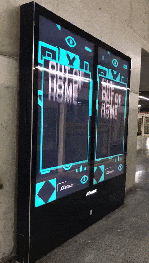
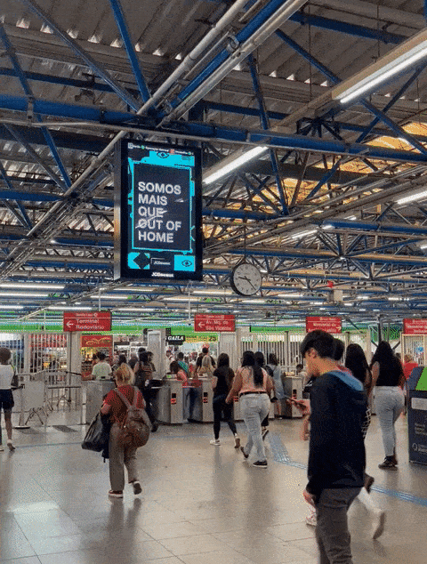
WE ARE NOT JUST A SQUARE
That was the starting point for the new positioning and visual identity we created for JCDecaux. It is always special when we have the opportunity to give a brand a new tone of voice and a new look.
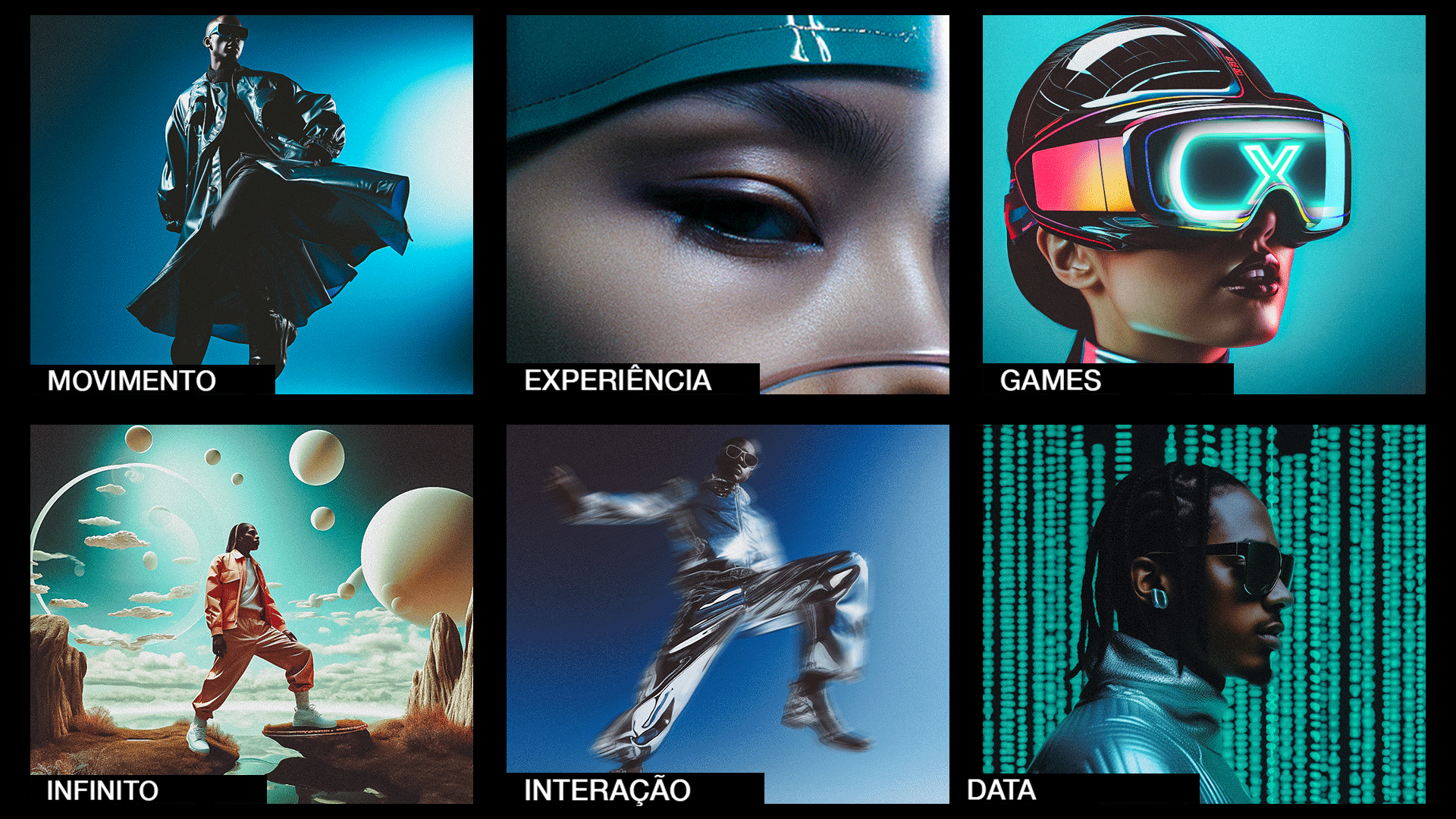
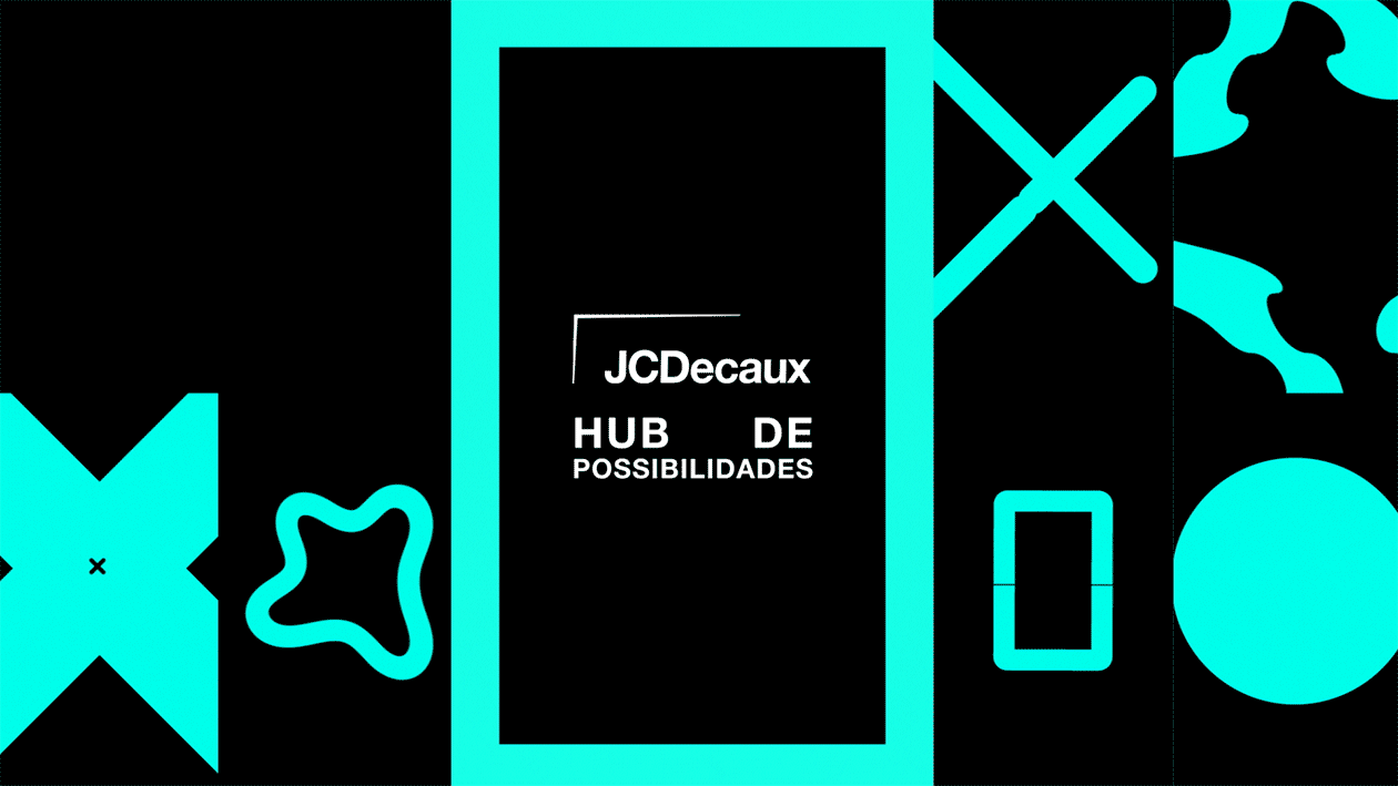
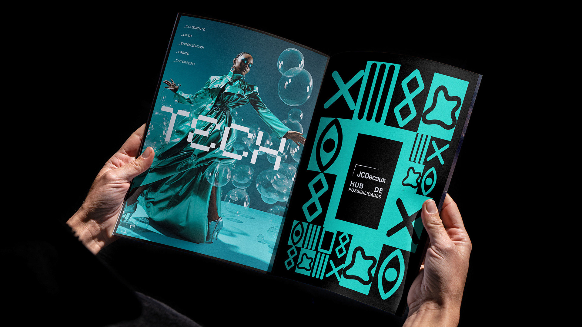
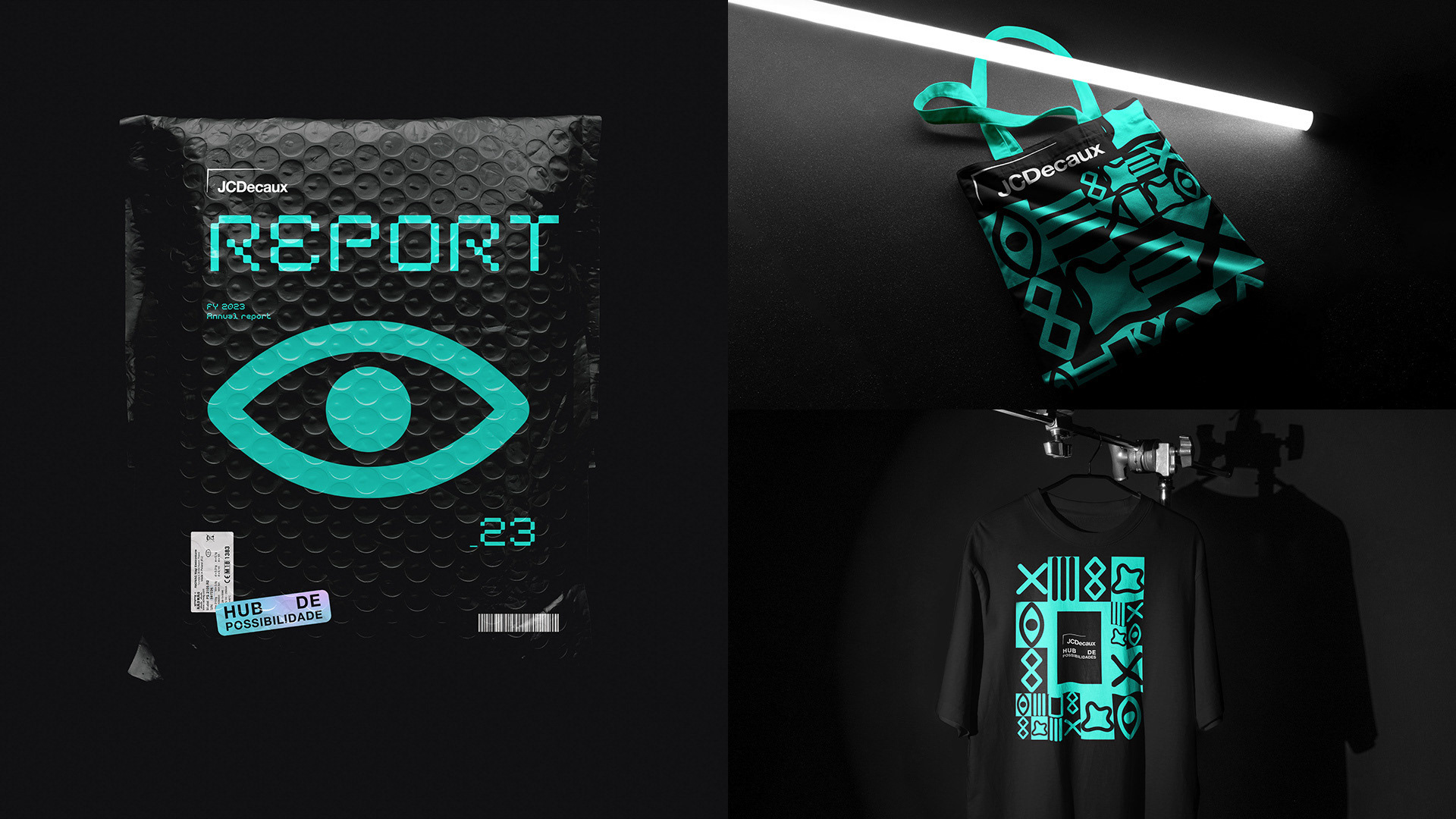
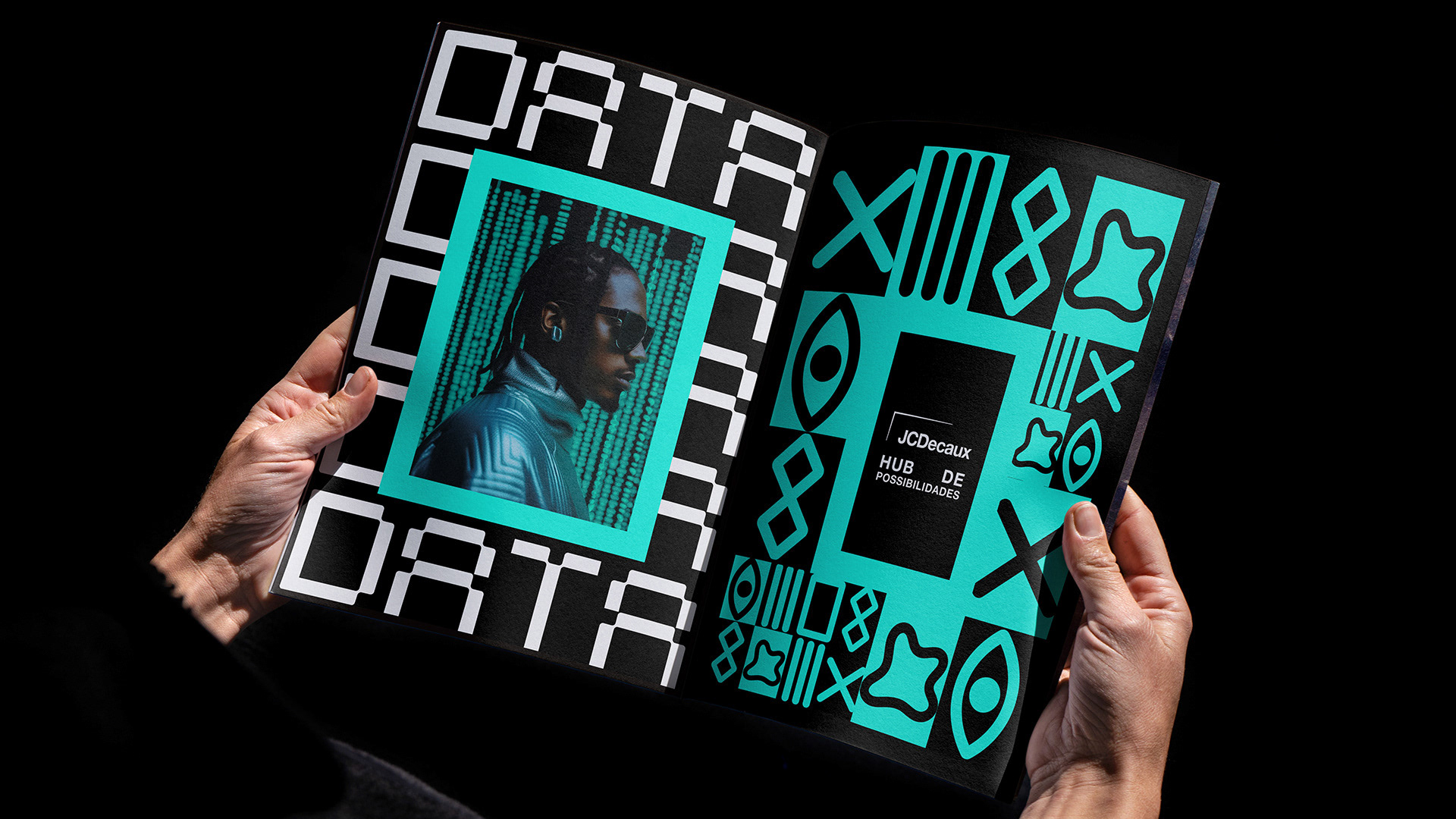
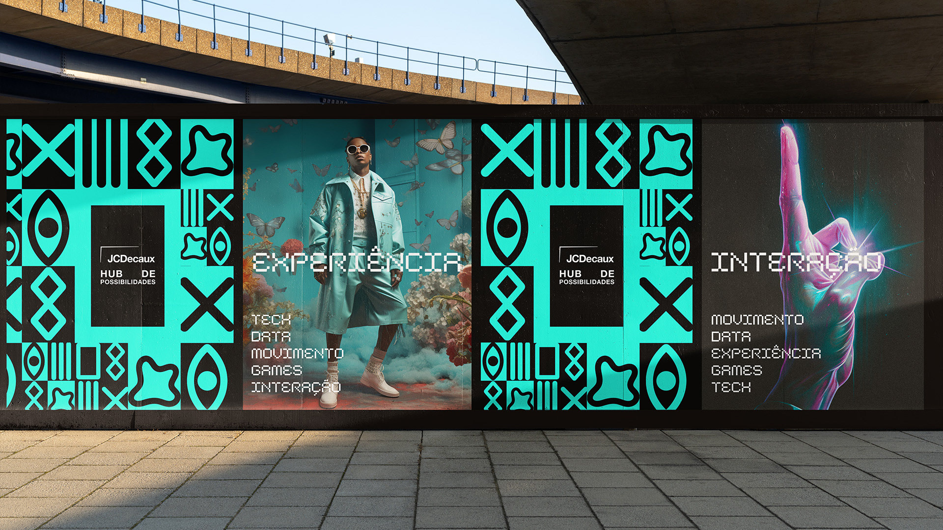
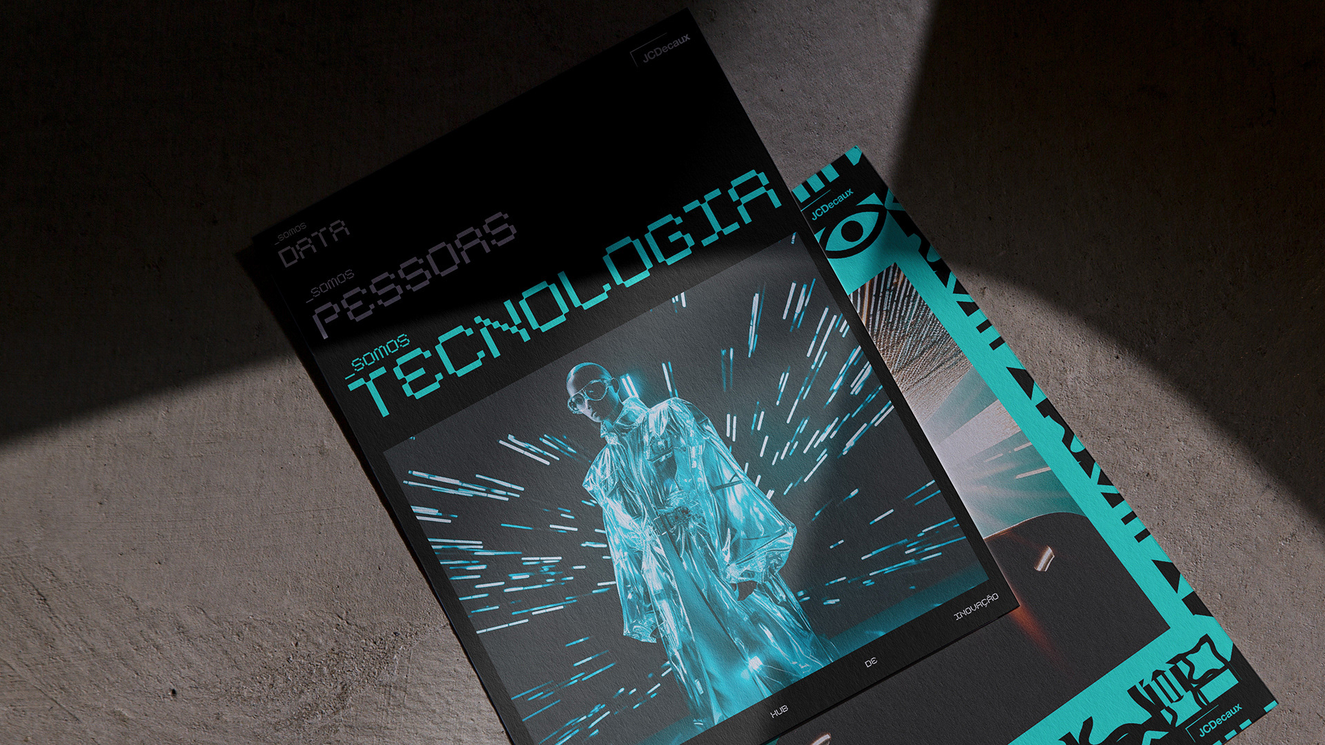
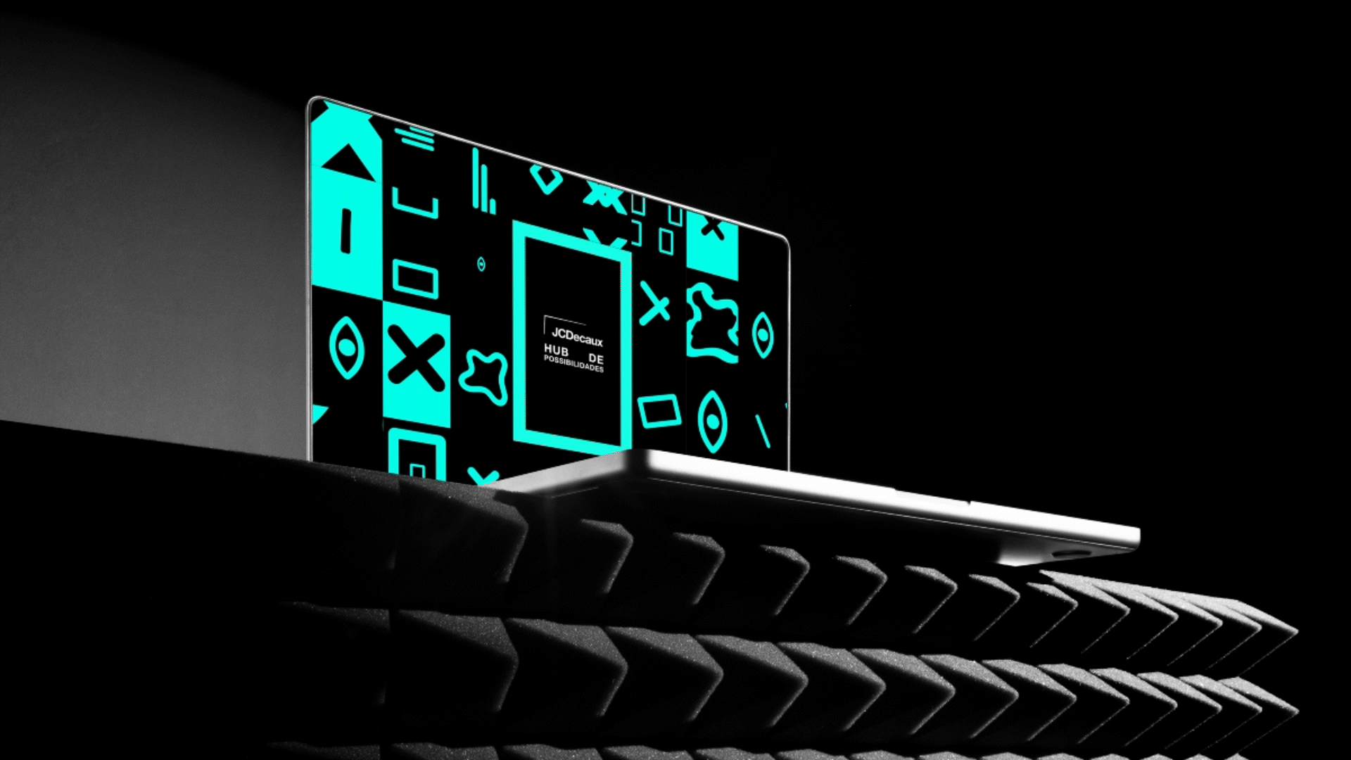
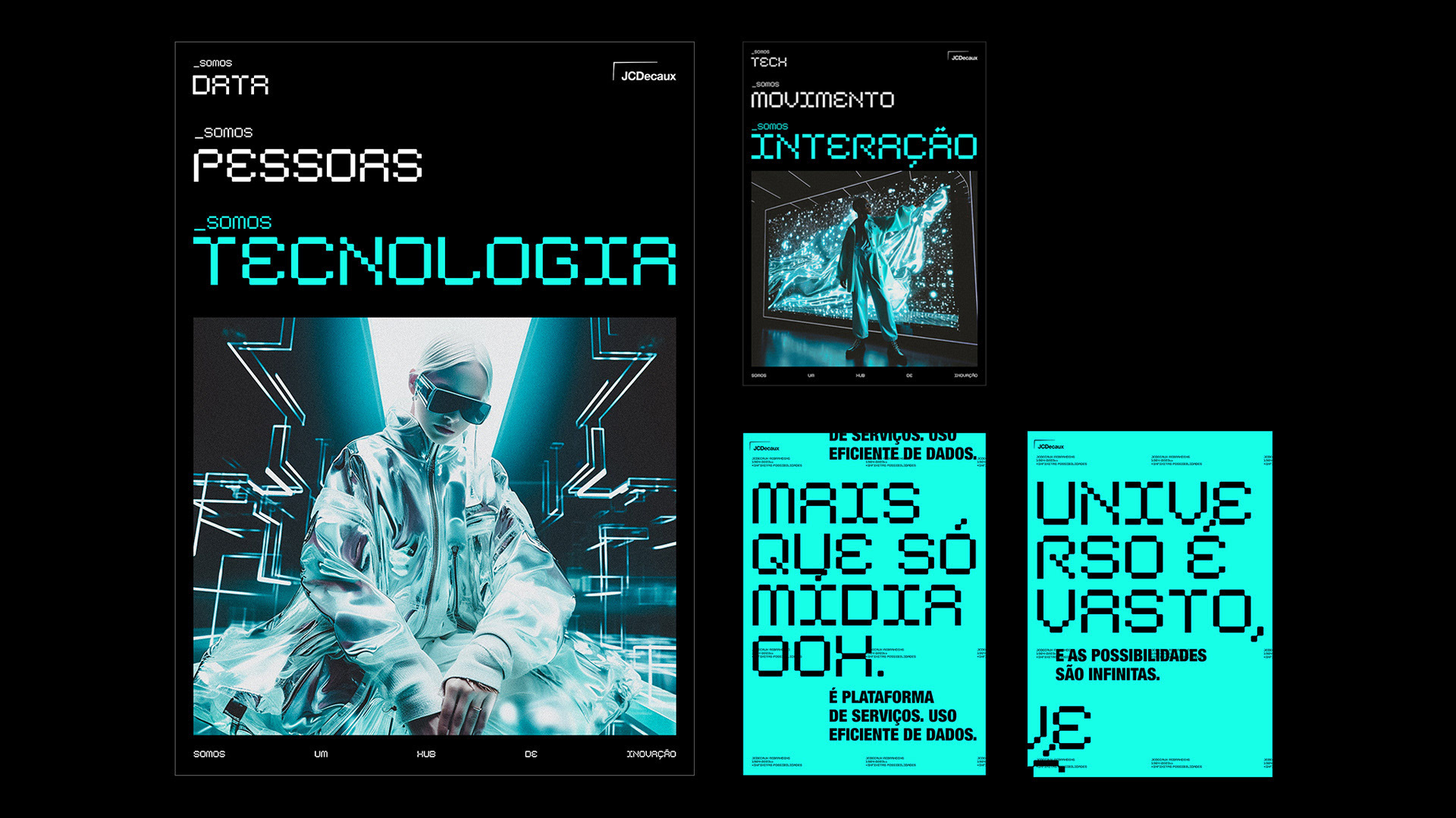
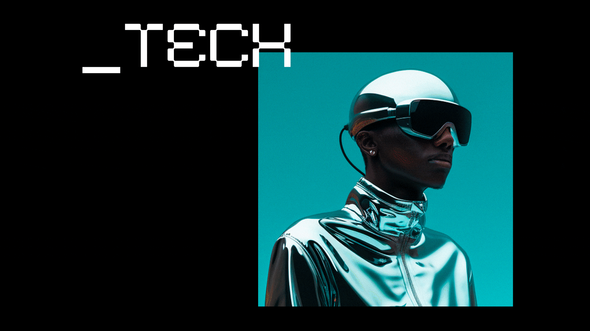
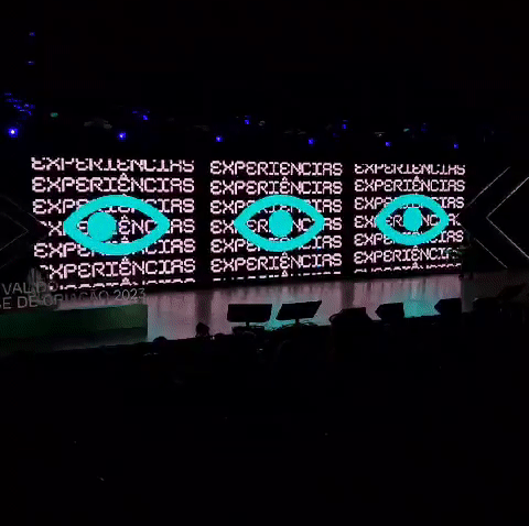
The idea was to make it clear that JCDecaux is not just a rectangle, meaning it is not just a traditional OOH format. It is much more than that. It is technology, innovation, entertainment, experience, data, and much more. A true hub of endless possibilities.
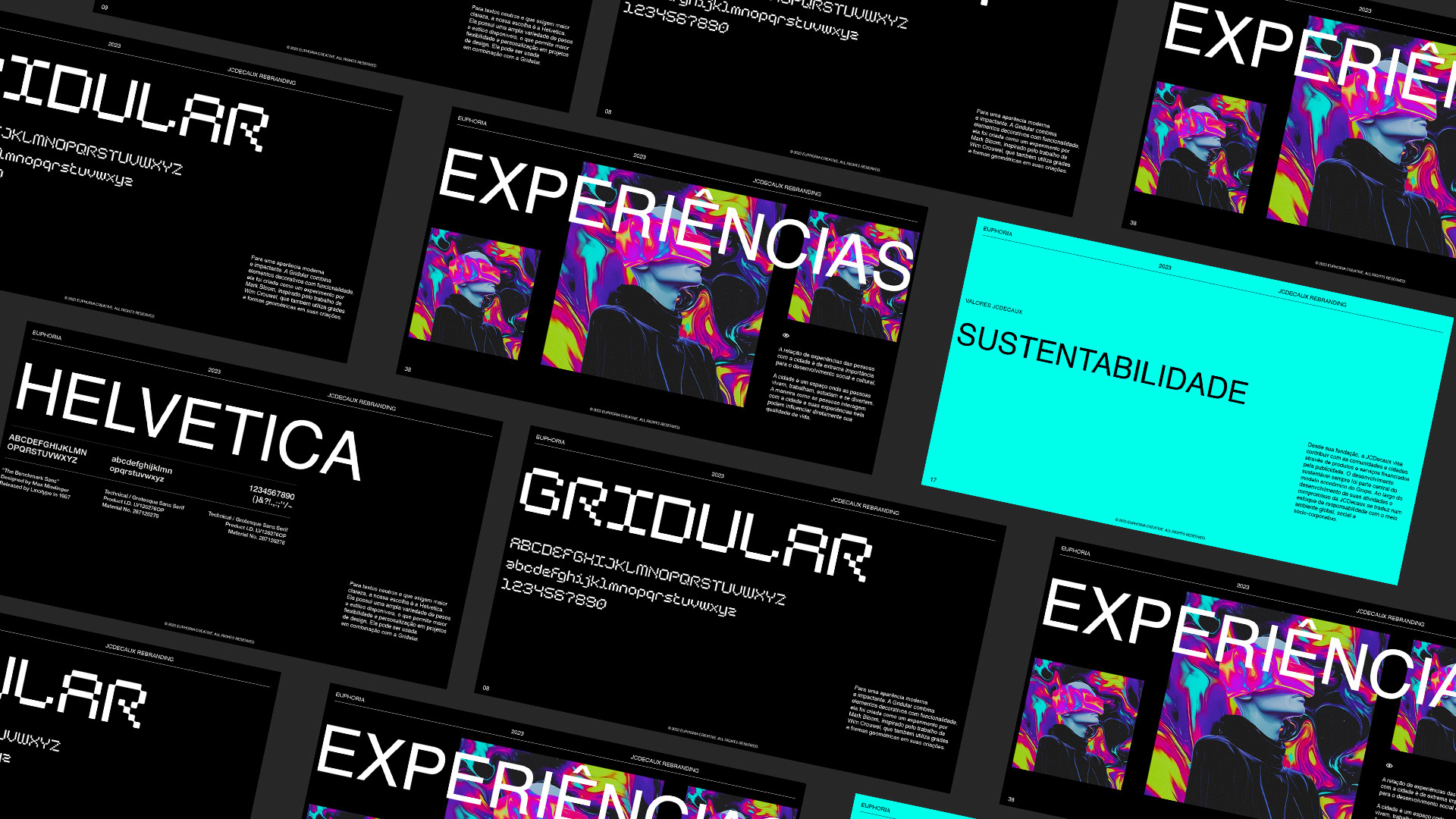
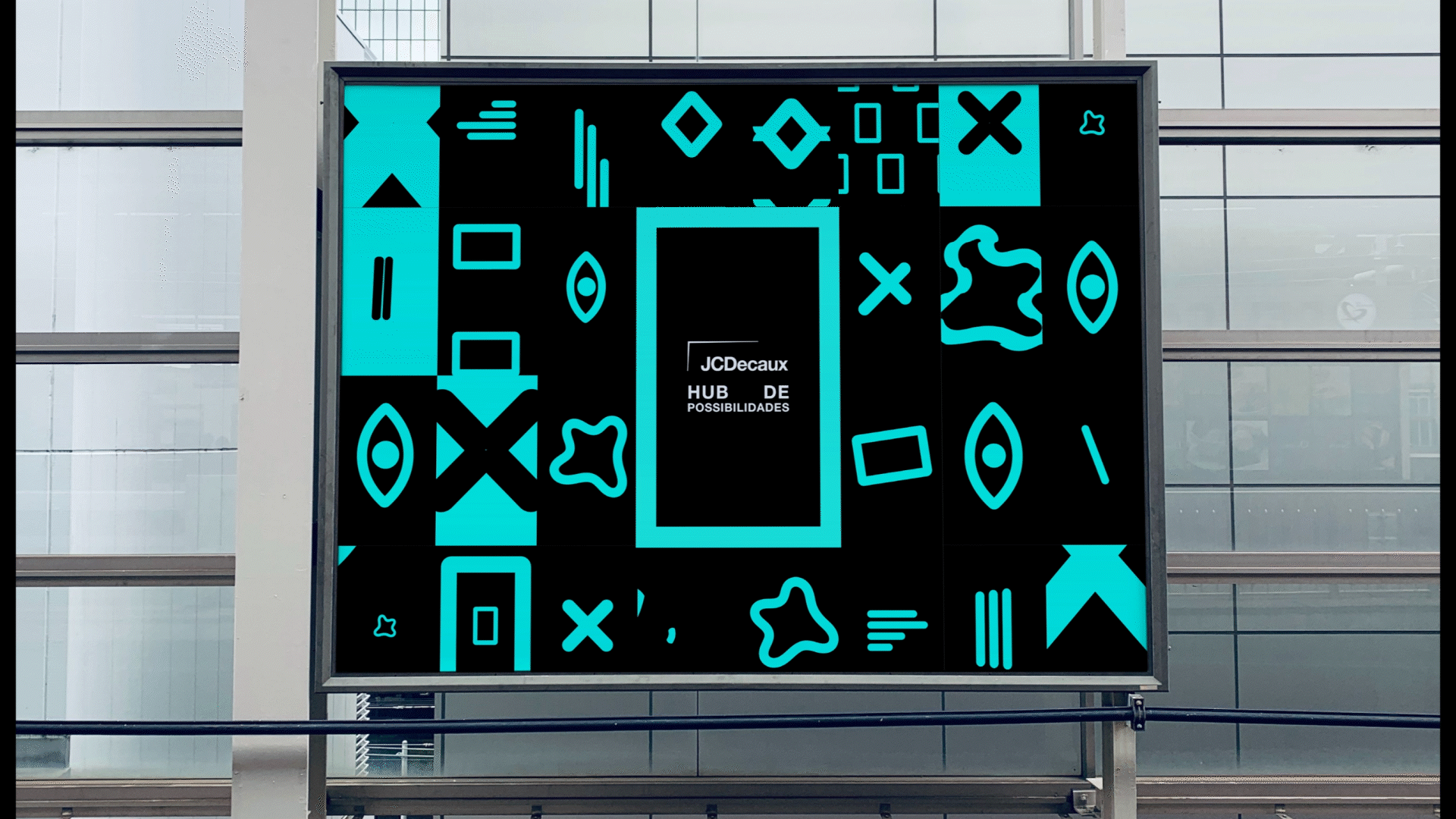
To bring this idea to life, we created a design system with a set of icons representing the different capabilities and offerings of the company. All of it built with movement, a dynamic visual language, and a strong exploration of the brand’s global color palette.
An evolution for a brand that has been in the market for nearly 60 years. May the next 60 be just as remarkable as the journey that brought it here.